
Common Languages
2023 - Present Language Justice; Visual Identity; Website deisgn.Interpreting for social change.

Bridging language barriers to building collective power.
Common Languages is a non-profit organisation that provides interpretation and translation services for social justice organisations. As part of a network of organisations working towards language justice, and Common Languages believes multilingual spaces are essential for social movements to organise across borders and transform society.
As the creative lead at Common Languages Collective I have worked together with the team to create a visual identity, strategic digital visual communication and a website design. Throughout the design we’ve implemented accessibility standards and design justice methodology when working with communities. Please let me or one of the team know if you have any feedback you would like to let us know.
As the creative lead at Common Languages Collective I have worked together with the team to create a visual identity, strategic digital visual communication and a website design. Throughout the design we’ve implemented accessibility standards and design justice methodology when working with communities. Please let me or one of the team know if you have any feedback you would like to let us know.
Photo of language justice movement protest; Colin Lloyd, 2021.

The basis of the identity are diffused abstract shapes representing knowledge sharing in a subtle
and abstract way. Evoking the idea of a
network of interconnected ideas and people
working together to exchange knowledge
and information. By using diffused imagery,
the identity suggests the idea of sharing
knowledge without being too literal or overt,
allowing it to be adaptable to a range of
contexts and applications. The font from the
logo is crafted to provide easy readibility.
The Common Languages Collective website
features movement, clear typography,
playful imagery and color to create a space
which is easy to understand and acessible.
The splash page references the idea used in
the logo around the diffusion of knowledge
which is aided by interpretation.
The front page is designed to function as an information hub which accesibly states important information a user might be questioning when hearing about Common Languages.
You can see it here.
The front page is designed to function as an information hub which accesibly states important information a user might be questioning when hearing about Common Languages.
You can see it here.
ELEMENTS
The hand drawn design elements of the megaphone and interpreter are used throughout the site and branding to visually identify certain topics which were decided vital to Common Languages. These are a selected set from the growing library of symbols which will be used to help identify areas of interest.
The megaphone symbolizes moments in which we ask for an opinion or a persons voice and the interpreter symbolizes bridging communication through translation/interpreting work.
01:
![]()

02:
![]()
The color palette of Common Languages
Collective uses shades of cirtus and earth
tones. These colors allude to the idea of
knowledge, collaboration, optimism, and
being rooted in ecology. Within color theory
bright, vibrant colors like chartruse (yellow
green) and the intenser green evoke the
idea of growth and learning, while warmer,
more muted colors like orange red and
browns suggest the idea of collaboration
and sharing.
Color scheme 2023.
STATIONERY
The stationery design is based on transparency and ease of use. Using a grid system the information is easily accessible coordinated with typographical elements to highlight key infomation. As part of the international Language Justice movement Common Languages Collective values it’s ability to communicate fiscal responsibility as well as clearly state information on the impact of the work being done.
The stationery design is based on transparency and ease of use. Using a grid system the information is easily accessible coordinated with typographical elements to highlight key infomation. As part of the international Language Justice movement Common Languages Collective values it’s ability to communicate fiscal responsibility as well as clearly state information on the impact of the work being done.

A letterhead and invoice design.
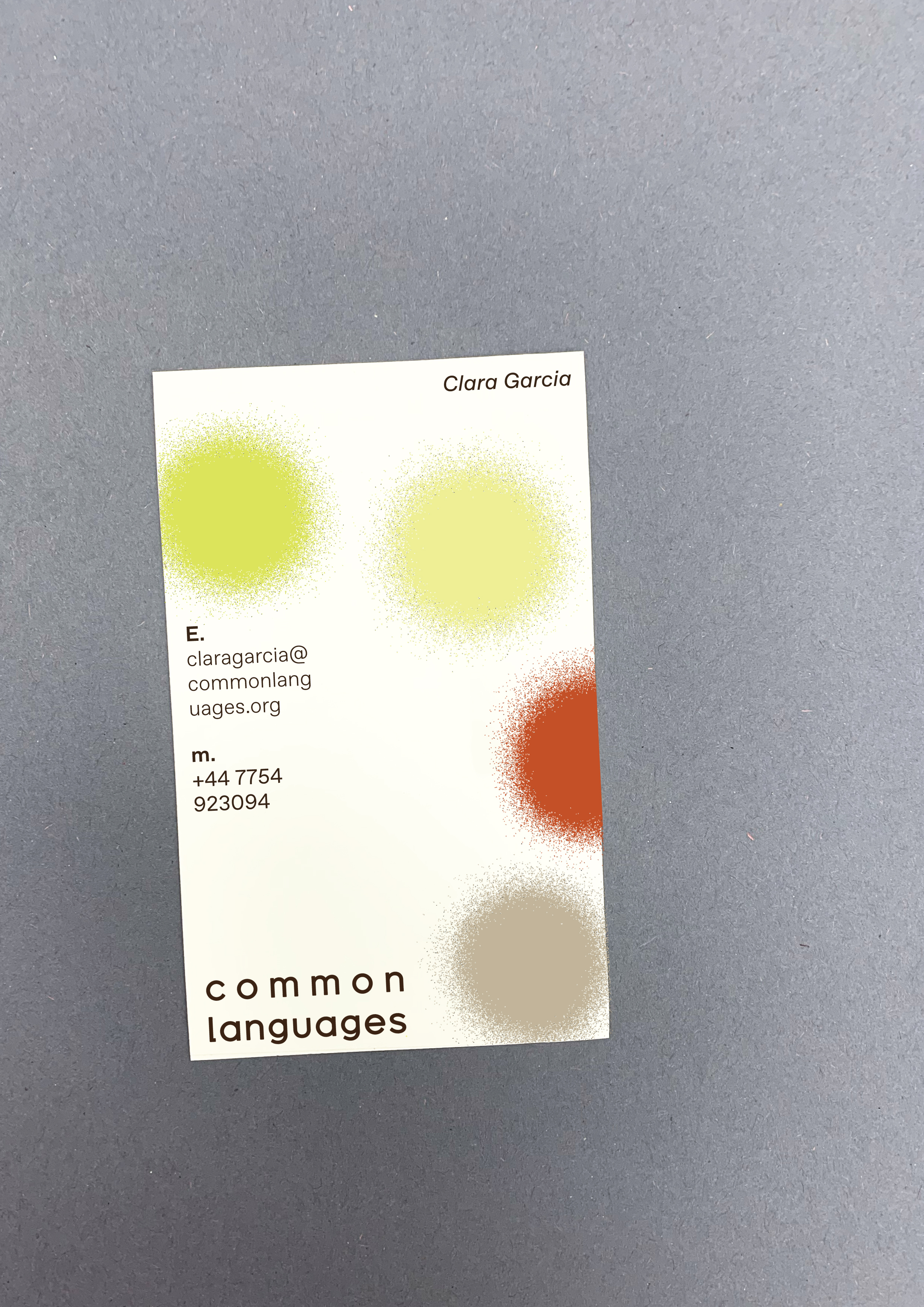
Common Languages business card.